Check boxes
 |
Summary:
|
Java
Related design guidelines |
| ChoiceGroup | |
|---|---|
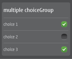
Figure 1. Multiple choiceGroup
 |
|
| List with check boxes | |
|---|---|
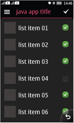
Figure 2. Custom list with check boxes and Action button 1
 |
|
 |
Summary:
|
Java
Related design guidelines |
| ChoiceGroup | |
|---|---|
Figure 1. Multiple choiceGroup
 |
|
| List with check boxes | |
|---|---|
Figure 2. Custom list with check boxes and Action button 1
 |
|